Monday, March 10, 2008

Material Lust - Nendo, Josh Jakus - Bags

Returning to the most basic of materials, designers Nendo and Josh Jakus both explore the aesthetics of the mundane.

Nendo, a Japanese firm working in architecture, interior, graphic and product design, produced four roototes (a clever multi-pocket tote bag design by Super Planning). Each concept re-visits the everyday, such as paper bags and shopping receipts, with a compelling graphic treatment. The tromp l'oeil effect is playful and transforms an otherwise ignored element of our typical experience into a desireable object.


John Jakus, a Berkely, California-based designer is similarly focused on "making experiential connections between form and function." His bags, and various household inventions, are made of recycled industrial felt, a most basic material. Simplifying his material choice elevates the ingenious functionality of his unique enclosures and formed structures. Even in a simple clutch, Jakus' lust for material purity is evident.

Many Jakus bags are available in Chicago at Hazel.

Philips Design Probe

Termed a "dedicated far-future research initiative," Philips investigates the future of our senses with nanotech, smartinks and oleds.


SKIN looks to the future of tattoos. When activated (likely with heat, natural human voltage, or chemical reactions in the skin, Philips predicts the animated, self-revealing tattoo. SKIN enables us to express ourselves through skin art that reveals how and when we choose.


Another investigation within SKIN is the dress project. Using various forms of lighted textiles, clothing could express emotions in real time. Philips foresees a shift from intelligent to sensitive technologies, wanting to infuse technologies with our humanity, rather than the other way around.


An in conjunction with STELLA, a European project for electronic textile development, Philips brings us Skintile. Part clothing, park skin, Skintile looks to the future of integrated jewelry that can not only express our moods, but enhance them as well. Philips calls Skintiles "semi-disposable, bio-compatible, non-allergenic, breathable, mass-customizable, self-contained body worn accessories."


View other Philips Design Probe concepts, and leave your valuable feedback here

Monday, March 3, 2008

Aesthetic Revolution, or Revolutionary Aesthetic?

Revolutions don't usually have print production budgets. And so we associate their ephemera with low-cost, one or two color reproductions that can be produced cheaply and in smaller runs. If the movement went bust, no harm done, but if it took off, print production had to scale-up at an alarming rate and couldn't afford to be held back due to photo quality or press checks.

This generation saw the commoditization of that aesthetic: Che Guevara's face, in black vector-style art, on posters, stickers and t-shirts. For decades, the revolutionary style was relegated to angry teens and misinformed college students trying to make a cheap statement of rebellion. But the power of revolutionary design is making its way through our cultural landscape once again.


What do the aesthetics of revolution look like now? Not much different.

It's present on book covers such as Dave Eggers' What is the What, a story of an African Genocide survivor. Eggers, the founder of McSweeny's, thoughtfully pulls from the past to speak to the weight of his subject's experience.


And most recently, in our current political climate. The flat, silhouetted style of American Presidential Hopeful, Barack Obama posters, design by Go Tell Mama I'm for Obama, carries with it a distinct revolutionary tone.

The earth-toned palettes reference revolutions-past, using gestalt patters of bull-horns to create sun rays circling the figure-head of the movement. The typeface remains primitive, the application intentionally loose. Reds and blues pop to excite the viewer, creating just enough positive energy to become iconic, and avoid the dreaded tag of propaganda.

Barack has been able to grab the imaginations of a young design-centered audience like no other candidate in our history. Here, that reality becomes clear, as design and color differentiate this candidate in a clear strategy to connect the youth with his message of "Change." And for better or worse, strong design seems united with politics once again.

Taking Care of the Mondays


Papabubble, a new high-end candy store in Barcelona takes a modern approach to packaging and color. The neutral, if not industrial hues of the shelving and packaging sharpen the otherwise apothecary feel of the space, using the bright and playful palette of the actual candy to liven the store.

Multiple types of packages, from clear plastic to boxes and jars, visually transform the candies into medicines, jewelry and accessories.


Papabubbles challenges another Barcelona candy boutique, Happy Pills. Also playing on the apothecary theme, Happy Pills keeps it traditional using large medicine jars with opaque white labels. But Happy Pills sends a strong message with their hot pink branding, especially the large plus-sign. The pink both clashes and compliments the wide range of candy colors, creating
a visual buzz throughout the shop.


Both shops take our memory of penny candy and turn it into an iconic, trend-forward experience using the pure energy of color. The sheer delight of color and candy will brighten up any Monday, if taken according to Happy Pills' orders.

Monday, May 28, 2007

Let Me Tell You Something: Virgin Atlantic

In a sort of softened guerrilla campaign, Virgin Atlantic has smattered urban areas with giant, red airline sick bags. Often placing these bags over movie and music posters, the ads have a subversive, irreverent feel, being just small enough to reveal the edges of the content they are so obliviously covering up. They want to be as hip as those underlying posters, but also feel like a step above, content-wise. And they mostly succeed.

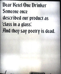
Apart from the bright red color and the three-dimensional quality of the bags, the design is limited to a wall of copy. Long-form copy has made a bit of a comeback lately, as seen in recent ESPN and Ketel One ads. This isn't easy, as the copy has to be extremely rewarding to the reader, in order to justify their time and attention.

While the sick-bags, in their giant form, really appear more like grocery bags at first, the headline "How did air travel become so bloody awful," converts the image for the reader. It also helps determine the particular company ("bloody awful" + red = Virgin). And the copy is indeed rewarding. The smart, sharp narrative replicates a conversation had among the wittiest of your friends about your hatred of air travel, and more precisely, airlines themselves.
Long-form copy can work. It requires a devotion to perfect typography, and quick writing that understands where the reader is physically standing, and what else will be in their visual landscape.


Like Southwest, Virgin gets its audience, and they integrate the brand essence into everything they produce. Virgin designed these ads for the exact space they appear in: in the midst of constantly changing visual clutter that relies on large-format photography. By going with a three-dimensional object and copy-only graphics, they violate the very medium that are competing with, and win. The headline copy is large enough to read from the bus, and the body is enjoyable upon closer inspection. More than just pushing their services, they partner with the reader through a conversation, and push back against boring ads and stripped-down airline service by providing an experience, even on the side of a wall in an alley.

Wednesday, May 2, 2007

What happened to Sports Illustrated?

Let me start by admitting that it's been awhile. I haven't picked up an issue of Sports Illustrated in years. But when my wife enthusiastically showed me the new issue, demanding that we find a De La Hoya vs. Mayweather party to go to, I didn't exactly feel a nostalgic twinge for the old mag. I felt sad.

I remember SI as the National Geographic of sports photography. Huge spreads of unbelievable action shots that made me dissect a
slide into third base right down to the dirt and laces in Rickey Henderson's cleats. But this was not the SI of old, or maybe it was. The same tired call-out bars and text formatting with even weaker images of ballplayers in mid-swing and sweater-wearing coaches yelling from the sidelines.

Let's face it, print has changed. Since USA Today started mimicking the web, almost every publication has tried to incorporate exciting graphics and innovative sidebar shapes into their spreads. And while many certainly miss the mark, or overshoot by a long shot, just as many have found a balance between serious, engaging content and visual excitement.

Take ESPN The Magazine, for example. Large format and slightly updated paper quality, along with gutter-breaking graphics and punchy writing have made this late-comer the standard. And it's not just about going after a younger audience here, it's about having an audience, period. You're parents may read The Times, but they're likely reading it online these days. We're used to the medium, and we expect better things. Speaking of The Times, even they find a way to make a fossil look current with information hierarchy and line rules.


I still remember the inaugural edition of ESPN The Magazine. I remember thinking it was too flashy and demanding. But it beat me down, and I'm thankful for it. It was an early predecessor to what is now becoming the fascinating re-interpretation of magazine design. It's not all copy and photos in a standard layout anymore. It's an experience of thoughtful, tactile, holistic design that rivals the web, rather than cowers in its limitations. Anyone whose picked up a recent copy of Esquire knows what I mean.

And sports itself has gotten bigger than the game in the last few decades. Now we know player's parents almost as much as we know their stats. We know about their record deals and charity work, and we follow them onto network news after retirement. And this isn't always just obsession, some of this stuff is damn interesting.

SI isn't just holding on to its principles. A visit to their overbearing circus of a site lets you know up front that this is a communication of the CNN network now, not exactly a pioneer in engaging content and design. Sigh.

Monday, April 30, 2007

US Cellular - White Sox Ads

US Cellular has released their latest Chicago White Sox ad campaign. The ads, meant to kick off the season and boost ticket sales (much needed after the Sox had trouble selling out even post-season games the last few years), play off an earlier series done by the White Sox themselves. The first issue of ads from two years ago exhibit World Series winning bravado with aggressive, sarcastic copy meant to rile the self-described, humble Cubs fan.

Where this newest series of ads succeeds is in its simplicity. Built for public transport, the ads are horizontal with dramatic action shots in stark, overexposed black & white. The copy is sparse, but cocky. One reads: "I have two pitches: fast ball, and faster ball." Another: "Please don't come to the ballpark with a cold, I'll catch it."

The most thoughtful, and challenging aspect of the design is the large area of negative space in each. It can sometimes be difficult to make text feel grounded in a loose, open design. But the designers succeed by treating the text with the same rough texture as the photos. The large areas of white stand out in a cluttered ad space on the trains. By using both the exaggerated scale of the player's images, and the blank backgrounds, the ads are the first images to catch your eye when you step on board, seemingly defying their own space restictions. Anyone designing for a competitive space, such as a convienience store, magazines, or the Web for that matter, take note: less is more.